As an Amazon Associate I earn from qualifying purchases. Disclosure
Stunning Home Theater Paint Color Ideas! (For A Better Movie Watching Experience)
Home theater paint color ideas can be classified in 3 categories of colors; dark & neutral colors, primary colors, & custom color designs. These are further broken down into smaller subcategories monochromatic, analogous, & splitcomplimentary. The best home theater paint color schemes are darker as these help reduce reflected light on the screen, giving better picture quality in your content!
A major part of really ensuring that authentic, quality, home theater experience is feeling comfortably immersed where the enjoyment of that content takes place.
That’s because truth be told, your surroundings play just as much of a role in the experience as the speakers and display themselves.
Whether it’s a small home theater or large media room, the actual color of your entertainment room in particular plays a huge role believe it or not; yet it’s something that could easily be overlooked.
If done right however, it can make a massive difference in the overall feel of the room — making it really feel like you’re at the movies.
So that’s why today, we’ll be taking a look at a few different home theater paint color ideas you can use that hopefully inspire some awesome home theater color schemes of your own.
That way, not only are you able to find the color theme that best works for you, but can also be confident that you’re getting the best possible experience to fully utilize what you currently have.
Different themes work best for different situations though, so we’ll also be looking at what works best when, and why.
This is going to be a fun one, so get comfortable, and let’s get into it! 😀
Deciding What The Room Will Be Specifically Used For
So before you do any painting, rearranging, etc, you’ll want to first make note of what exactly the room you’re planning your home theater in will be used for.
Will it be used for exclusively watching movies? Or perhaps it’ll be a more casual room used for watching TV with the occasional movie thrown in?
Maybe it’ll be a game room for playing video games, or perhaps it’ll be a little bit of everything in the form of a man cave?
The reason why it’s so important to figure this out first thing is it’ll have a direct influence on the color that’ll work best for the room.
Choosing the right home theater paint color schemes can give the room an entirely different feel and help improve the movie watching experience quite a bit.
If you know that the room will primarily be used for movie watching, it’ll probably be best to use darker colors or even black since it’ll do a better job in that regard.
However if it’ll be used for more casual viewing, then you’ll likely want to go with lighter colors as it’ll make the space feel more open — rather than feeling constricted like it could with a darker color; especially with watching in the day time.
A mix of different viewing conditions would likely benefit from a somewhat darker room color like a burgundy for example, since it’ll essentially provide the best of both worlds with regard to not feeling too enclosed — while also doing a decent job with handling light.
The point is, take into account who will be doing the content consumption, the kind of content that’ll be used in the room, and the actual furniture & decorum in the room before deciding on a color.
That way it’ll compliment, rather than hinder, your viewing environment for your specific situation.
Remember lighter colors reflect more light no matter what the material of the wall might be so the lighter the color you choose, the more light that may potentially reflect back onto your screen
This is why grey and darker colors are generally thought of as better for watching content because they offer such a good balance between practicality while still making the room feel like a genuine home theater.
Though using colors that are dark are helpful when it comes to viewing, ultimately it’s going to depend on your preferences.
Once you’ve got that figured out, it’ll be much easier to decide on the color, which I’ll provide examples of a little later on.
First though, there’s something else you’ll want to keep in mind (well technically a few things)..
Taking Into Account The Lighting Of The Particular Room
Another very important thing to take into consideration is the lighting conditions of the particular room too.
Depending on what it’ll be used for, you’ll want to find the right balance between immersion and watchability.
What I mean by this is let’s say you have a room that you really only plan on watching shows in, but you recently felt compelled to repaint the room just to give it a different feel.
Well while you definitely still could, it wouldn’t really be necessary to paint the room a darker color since that need for extreme image precision that a darker color provides wouldn’t be something that’s necessarily important — especially if you happen to be a more casual viewer who might also have others that watch from time to time as well.
This is especially true if you watch your content in the day time as a room with a darker tone may dull things quite a bit.
I’ve also personally found that daytime viewing in a room with darker colors can sometimes lead to the room not really feeling the same as with a brighter color in a way.
Not saying this is what will happen in your case, but it’s just something that I’ve personally noticed from my experience so it is something to keep in mind.
However that being said, let’s switch gears and also say for example, you want to transform your current room into a full dedicated movie room.
In this case then, you’ll want everything including external lights to be as dark as possible, as that’ll have a beneficial effect with regards to picture quality.
But the big variable in both of these scenarios is the amount of light present both internally and externally, as this can alter the experience dramatically — which can be either good or bad.
So how exactly do you optimize for your specific use case though?
Well the first thing you’ll want to do is make note of any windows in the room and how they affect the screen from your seating position.
Do you often find sunlight drowning out the screen making it hard to see?
Or is the room simply bright from the sun light entering the room?
If so that’s the first thing you’ll want to immediately address.
Now there’s a bunch of ways to do so, but one of my favourites is using black out curtains.
These block a majority of light and so will immediately make things more visible on screen.
There’s also things like retractable shades and black out blinds which can help too. Basically anything capable of blocking any extraneous light is helpful in this case.
Not to say that a completely dark viewing environment isn’t best for image fidelity, because honestly it is.
But if you do plan on watching for extended periods of time, (and I’m talking about hours on end here) then either taking a break every so often, or lowering the backlight of the display can help alleviate this.
Another thing you can do to strike a proper balance between great image quality and practicality is using ambient lighting.
Of course the room should be somewhat dark, but you’ll also want enough light so that people can move around safely too.
There’s certainly a myriad of ways to go about this, but one of my favorite ways is to use track lighting as it allows for directionality since you can actually focus where the light shines.
This works amazingly well since you not only have control over it, but it’s diffuse enough to where it won’t cast a glare on the screen if set up correctly.
An ambient light in the form of an led light strip set up on the back of the television also works beautifully, and can offer even more customizability in the way of brightness and even color.
You can even use dimmer lights since that’ll also allow you to control the intensity of the illumination in the room — offering just enough light to where it’s immersive, but providing enough visibility to see your surroundings should you need to move around.
Things like tabletop lamps and fluorescent lights should be avoided as they don’t provide the proper diffusivity for a satisfactory experience.
Not only that, but they’re also likely to cast a noticeable and localized glare on the screen which can be incredibly distracting.
That of course does depend on the type of screen you’re using though; as a matte finished television and/or projector screen won’t suffer nearly as much (if at all) from this issue which might allow for that type of light source.
Even then, the ones I mentioned before will still provide for a more optimal experience.
So try to stick with a light where you can control the direction as well as brightness and you’re golden.
A standalone lamp that can be dimmed can also work too as long as it’s not directly aimed at these screen.
On a side note and if you’re especially meticulous, then you can even consider the color of the light as well.
This is a good piece that goes over that, but basically the gist is that warmer colors are not only easier on the eyes, but give a sense of comfort as well.
So should you wish to get the absolute best in terms of optimization of your room, then this is something else to make note of.
The following is an example of a lamp I feel works really well.
Although the color of the flooring will make a small difference when it comes to things like light reflection, the material of the floor itself will make a much bigger difference in terms of overall light management and even sound quality.
You may want something that compliments the color of the room of course, but not in a way that makes things seem mundane or samey.
How you choose to do that is subjective, so that’ll really depend on your own personal preferences as that may be something you prefer.
An important thing to remember though, is that the actual material used is much more important and where the real focus should be; as something like a shag carpet for example, will do a much better job at dampening both light and sound waves than say a hardwood floor would.
Similar to what was mentioned previously about flooring in terms of coloring and material, the same applies when it comes to the furniture and decor present within the room.
Of course style will be subjective, but what I personally do is go for decor that adds a sense of punctuation to the room without being overly distracting — since the focus really should be on the screen and the speakers.
This is an area where you can really get creative and give the room personality. How you choose to do this will ultimately depend on how you actually plan on using the room, so keep this in mind beforehand.
That said, here’s a few seating ideas that may prove useful.
Before we get into the different colors and themes, something really important to note is that the type of paint you use for the room actually does matter quite a bit believe it or not.
Glossy type paints tend to reflect light, which can produce glares; the opposite of what’s optimal.
Due to their reflective nature, glossy paints reflect light bounce from the walls and ceiling on to your screen.
Not only can too much light in your home theater room cause a glare, but this excess light can also wash out the picture, causing the image to look dull or drab by comparison.
To avoid these issues, the best type of paint to use is a flat, matte based paint in my opinion since that will cut down glare and reduce light reflection, allowing for much better viewing conditions.
This is also because matte paint has light absorbing properties when it comes to indirect and direct light.
It also has the convenient bonus of hiding any minor imperfections that may exist, allowing everything to look uniform and even.
You can even apply multiple coats of paint to achieve the darkest shade, which will help with even further minimization of light reflection including from the screen itself.
Projector paint is similar in this regard but comes with the additional benefit of allowing you to use the wall as an adequate projection screen since the matte finish of the paint won’t reflect light back towards you — making this another good option to use in a room.
Adhesive wallpaper can work too, as there many different color options and even finishes including matte.
So if you’re not big on painting, this could be something to consider as well.
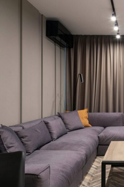
Dark and Neutral Colors & Where They Should Be Used
So in terms of the best colors to use for a home theater room, darker and neutral colors in the form of a matte paint are best as they provide the proper light reducing properties that often benefit visual content.
Think about the last time you went to the movies and try to remember what the room looked like.
Chances are, the room was likely a darker shade along with the furnishings; likely even the seating as well.
This is done to provide the most immersion while reducing as much light as much as possible.
Darker colors put the more focus on the content by not calling attention to themselves which further enhances the experience.
But as I’ve mentioned before, this is where knowing the type of room you want beforehand is key as you may want to keep some sense of versatility with the room; especially if you’re using it for more than one purpose.
If it’s a room where you plan on doing a lot of day time watching, then an entirely black room might not be best, whereas, a dedicated home theater room with primarily nighttime viewing probably would be.
It really is going to depend on your specific use case.
Ideally, if your only focus is watching movies & you want to get the best image quality possible, and it’s in a darker environment, then using darker colors for the walls and drapes would be better for dynamism.
Now with all of that being said though, let’s look at a few specific dark/neutral colors I think work best to inspire home theater paint color ideas you can implement & use — along with exactly why.
~ Matte Black
So keeping in mind the fact that darker room colors are best for light reduction, what better color to achieve exactly that than matte black?
Using a matte black theme for specifically watching movies is the most ideal color scheme in my opinion as it reduces the most light which helps the viewing experience.
However the thing is, its practicality can be questionable if you’re using the room for more than just movies since it can be tiring on the eyes in brighter conditions.
Just to reiterate, if your planning to just watch movies and use it as a dedicated theater room, then by all means — matte black is certainly the best option since it’ll provide for the best immersion in terms of an optimal home theater wall color.
But If it’ll be used for more than that, then there may be better choices to go with.
A big reason for this is that due to the light blocking capabilities of matte black, the effect that smaller light sources like lamps and such have on a room will be reduced even further.
This can be especially problematic for the instances where you’re not watching something and need to get around the room. If those happen to be your only sources of light, then it may not provide enough visibility.
Again, it all depends on your particular use case though.
~ A Darker Shade Of Grey
A good middle ground for versatility when it comes to properly managing the balance between optimal ambiance and actual utility in regards to designing a home theater room is the color grey.
It has the capability of providing enough light reduction for an exceptional viewing experience, while also being neutral enough that it looks in good in every day life.
Plus an interesting benefit I happened to notice is that it doesn’t tend to reflect extraneous color back onto the screen, which in theory, could provide for a more pure image quality.
Whether this is always the case or even noticeable is likely debatable, but the main takeaway is that it’s certainly a great color to use that works in a variety of conditions.
~ Darker Brown
Brown can also work as a suitable choice for a room I feel like when done right.
In my opinion, a subtle cinnamon or umber color tone specifically tends to give a nice enough balance to the room while maintaining a sense of sophistication.
Also when paired with a lighter brown, it can create a nice effect, adding depth and intricacy to the room.
Primary Colors & Where They Should Used
~ Dark Blue
A really versatile option and one of my personal favorite color choices when it comes to the primary colors is to use a darker shade of blue within the room.
Not only is it relatively similar to black in regards to light reduction & maintaining a dark enough atmosphere when it comes to time to watch a movie with the lights on, it still provides enough color to give the room a nice look.
When it comes to blues, there’s a lot you can use, but a few I think work particularly well are evening, oxford, and navy blue.
~ Darker Red
Another example of a pretty versatile color choice and great paint color idea is some sort of darker red.
Darker tones of red are a common color choice in many cinemas as it has somewhat similar light dampening properties to black, while still retaining that extra touch of color.
A ruby or even garnet color is a good choice to go with if you’ll be using the room for more than movie watching as it provides a dark enough setting for movie watching, while also giving the room a distinct look with other scenarios.
There’s many shades that would work, but those are just a few examples that look nice in my opinion.
Custom Color Schemes & What To Keep In Mind
You of course always have the option of coming up with your very own color scheme mix when it comes to the colors of the walls and furniture within the room.
While there’s many different color combinations you can use, the 3 I personally think work best when it comes to home theater color schemes in particular are monochromatic, analogous, and split complimentary.
Wait what?
Don’t worry, I’ll explain each of those, along with why and where I think they work best.
Monochromatic Color Design
Monochromatic color is using the same color or similar shades of the same color across everything in the room, ranging from your decorum and furniture, to even your walls and ceiling.
This is in my opinion is the best for those that specifically plan on using their room for strictly movie watching because it forgoes the usage of loud colors, and subsequently places a much heavier emphasis on the focal point of the room, the display.
For example going with a matte black finish for the walls coupled with a dark grey overtone for the seating & decorum — in tandem with a subtle down lighting and muted carpeting is a look that can work really well.
While it does provide the most immersion for sure, the reason why I feel it works best only for this particular scenario really relates to the biggest drawback to this type of theme; and that’s monotony.
If this is a multi purpose room where you might have guests over in the day time for example, it could be seen as lacking flair or real character.
Having everything the same or similar color wouldn’t feel the same as having the splashes of colors other rooms might have.
So if you think the room will be used for more than that, then there’s certainly more suitable themes for that purpose.
Analogous Color Design
Analogous Color theming is a little similar to Monochromatic in that they may use similar colors, however the difference with this one is that it uses multiple colors & shades that are close to one another on a color wheel.
This allows for enough variability that you can give the room enough decoration without things being too distracting at night.
It’s a good choice if you do plan on the room being multi purpose since it allows for a good amount of depth when it comes to design, while still giving you a fully immersive experience with movie watching.
An example of this is making a blue themed theater room where there’s a dominant & darker shade of blue — complimented by lighter shades of blue and indigo, topped off with various adornments throughout.
It would give enough variability to look captivating, while still sticking to the cohesive nature of the theme.
Another example is perhaps you decide on a garnet color for the walls, with a walnut hue for the furniture, and darker mahogany strip running through the middle of the room serving as a sort of statement piece for the rest.
The point is, it undoubtedly allows for a myriad of choices — so chances are you’ll be able to find something that works for you and your particular preferences with analogous design as a basis for the color scheme of the room.
Split Complimentary Color Design
Spilt complimentary gives the widest creativity range of the 3 color schemes mentioned here as it provides you with the ability to use a base color, and 2 adjacent colors of that original’s complimentary color.
For example you could use dark green for the walls, and then accent it with different tones of brown and even purple for a unique yet cohesive look for your room.
It’s certainly the most varied out of the 3 color designs since you do have so many possibilities, but once you get it right it can look really amazing.
Something to also keep in mind that’ll also help when it comes optimal image quality is using a darker color around the display as a border.
This will provide a bigger contrast between the screen & the room, while also helping to mitigate light pollution and reflections around the screen.
If using black for the room or even wall of the display isn’t feasible for the theme that you’re planning, try to use a darker color for a similar effect within the room.
A Custom Design
These are all just suggestions of course, since you can always tweak these by adding your favorite color decorum as accent pieces, or simply coming up with your own theme all together entirely.
The reason I chose those 3 color schemes in particular is that I personally feel they do the best job of balancing aesthetics, immersion, and cohesion within the room.
But there’s a plethora of possible combinations really, and that includes creating your own.
One theme I personally enjoy is black walls with red seating as I feel that just looks incredible.
However for you that might be entirely different.
But that’s what makes home theater in general so great honestly, since you have the ability to truly make it your own.
Final Thoughts
Well, that about does it for this one.
Hopefully you found these paint color ideas helpful, and after this, have in mind a few color schemes that might work for your particular room or space.
There’s certainly a lot in the way of customizability and even things to consider, but that just means you have the capability to create something that truly looks incredible.
If you have questions or concerns though, definitely reach out and I’ll be more than happy to help.
Hey everyone it’s nice to meet you. I'm Jay, writer & founder of the site Easy Home Theater. I've been with this hobby of home entertainment for many years now. I decided to create this site to be a helpful resource, and share everything that I've learned from personal experience with you. I also happen to be a huge gamer, lover of all things tech related, and a major fitness buff (love weightlifting)


")

")
")

Leave a Reply